The Race Card Project®
The Race Card Project® Logotype
- There are two shapes for The Race Card Project logo, square or rectangle
- Each shape is available in black or white
- Chose the color version of the logo that gives the most contrast on your background
Using the logo
- The square version should only be used for applications where this is the only option, such as icons, web pages or social media profiles
- You should stick to the proportions below, and NEVER stretch or squeeze the logo
- Don’t modify or change the logo colors
- The logo must not be obscured or overlapped with text or images
- There needs to be clear space all around the logo, roughly the size of the D character
Back on White
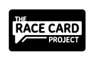 Basic version to be used in most applications.
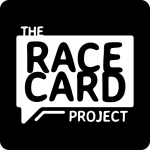 Square icon ONLY for profiles and applications where a square crop HAS to be used
White on Black, or ‘Reversed’
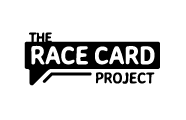 Basic version to be used in any applications that have a darker background.
Merchandise, signage and high-res print
Below are high resolution and vector files. Do not use these for websites. You may not be able to open all these files as some are designed specifically for printers, vinyl cutters, signage etc.
The Race Card Project logo pack (high resolution and vector) 08-14
Typography
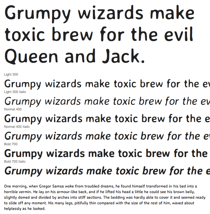
The Race Card Project font is Averia Sans Libre, which is available as a Google Font.
The Bridge at Aspen
Please note this branding is still in development.
The Bridge Logotype
For web and digital communications such as email.
- You should stick to the proportions below, and NEVER stretch or squeeze the logo
- Don’t modify or change the logo colors
- The logo must not be obscured or overlapped with text or images
- Do not crop the space around the logo


